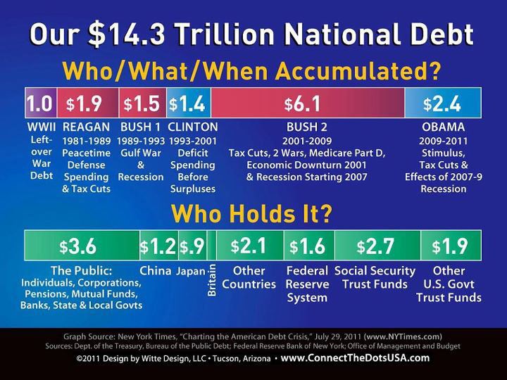
1. This chart shows who is to blame for most of the $14.3 trillion national debt and, despite GOP bleating to the contrary, it isn’t Obama.
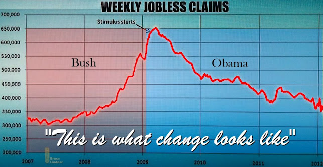
2. This chart shows the number of unemployment claims have been going down as a result of Obama’s stimulus package.
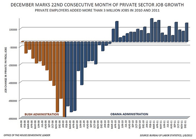
3. Job growth under Obama.
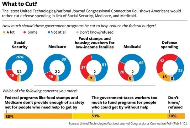
4. How the public thinks their money should be spent and cuts made, as opposed to what the GOP and official Washington says.
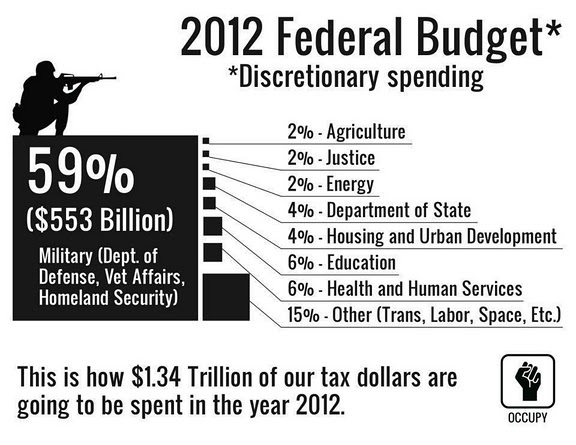
5. Where our money is going. Note that the Pentagon and the MIC suck up nearly 60 cents of every tax dollar.
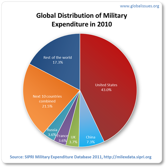
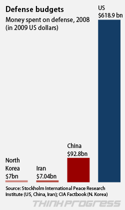
6. Finally, a comparison between what we spend on defense and what the rest of the world spends. The US expends about six times what China, Iran and North Korea combined spend on their military. (See second chart below.)

